【Singers】 ClariS / Alice☆Clara (アリス☆クララ)

claris

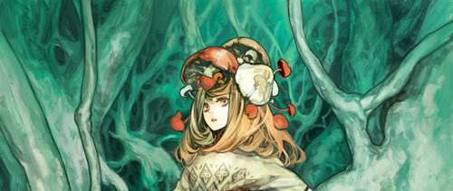
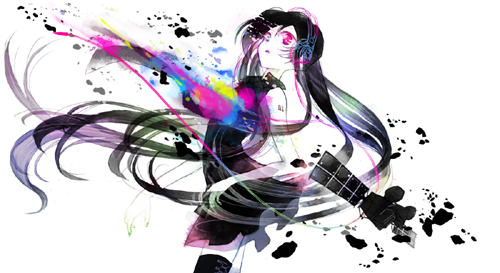
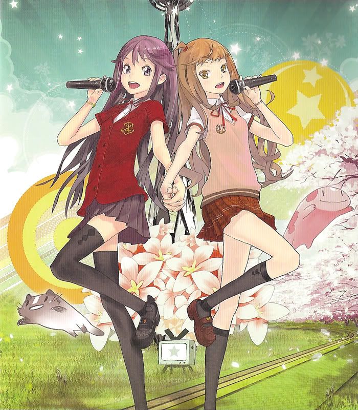
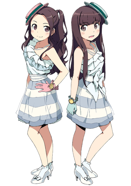
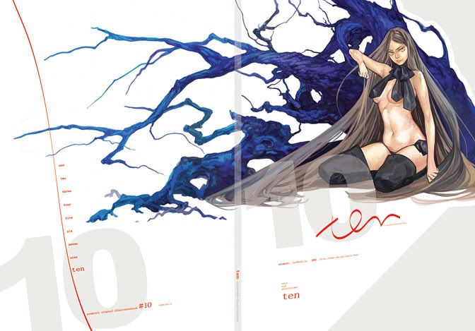
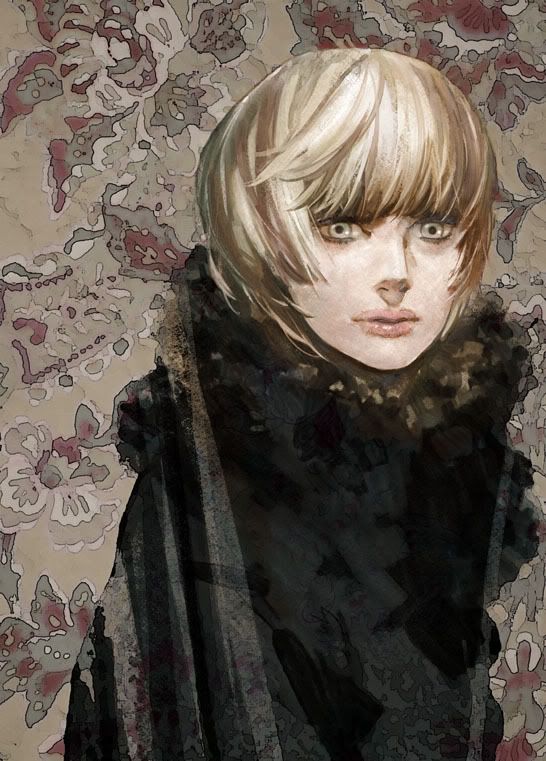
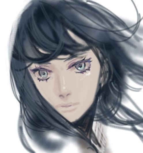
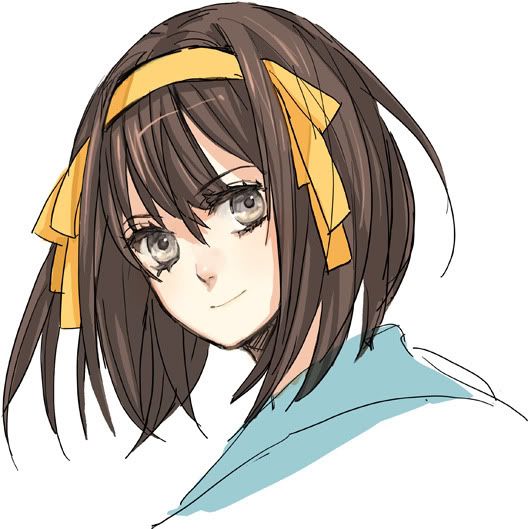
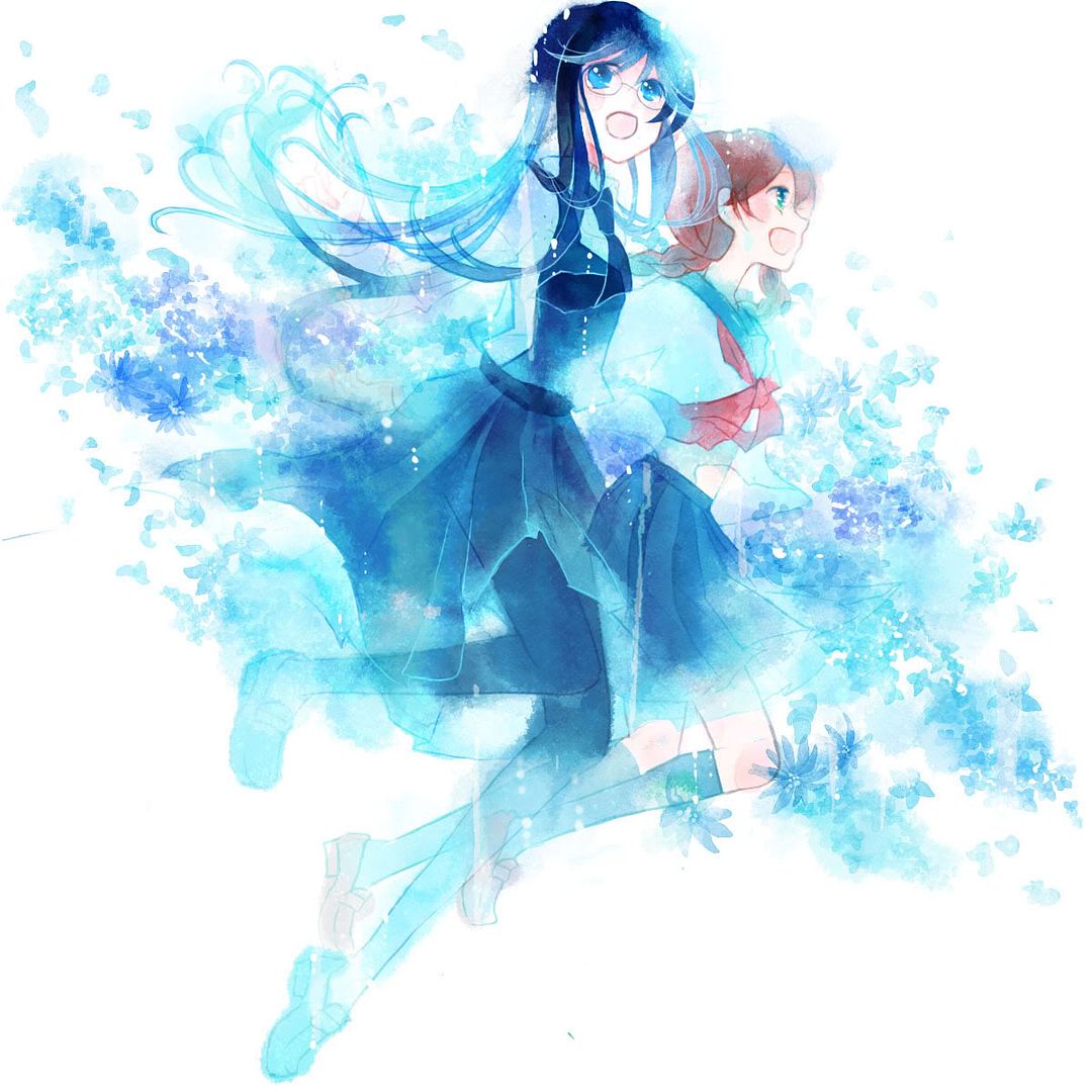
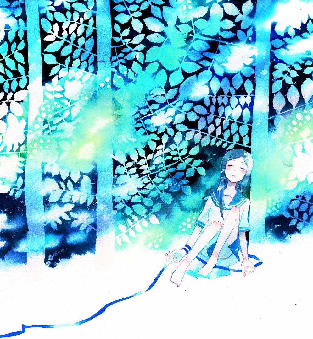
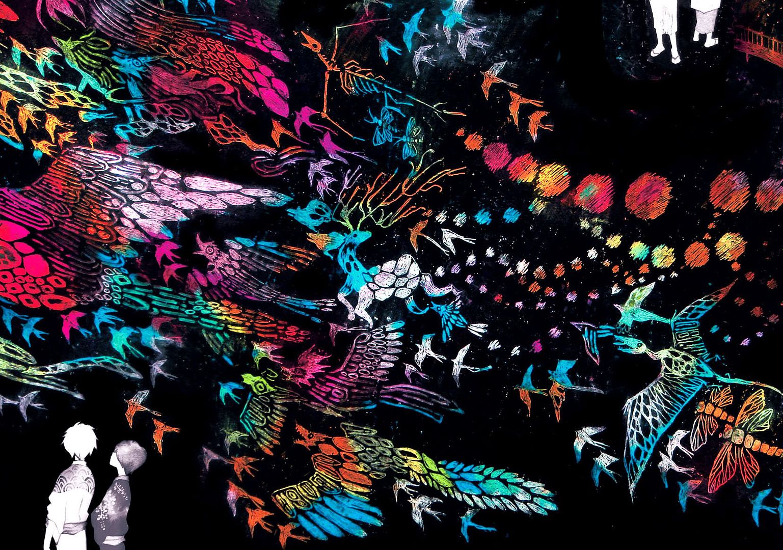
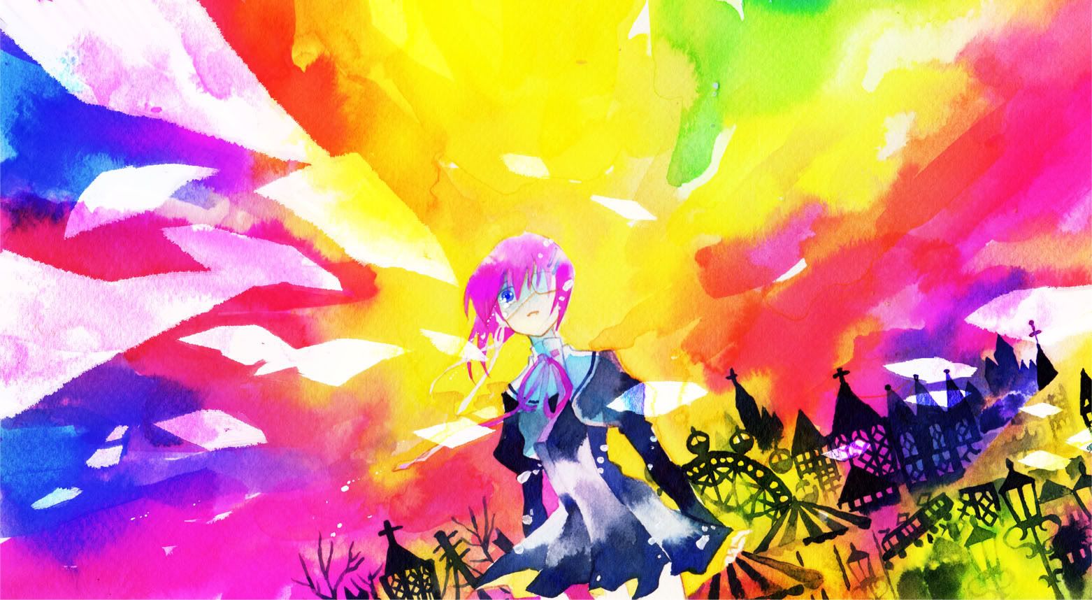
ClariS is a musical unit consisting of two singers, Alice and Clara. They are most well-known for their first major debut song “irony”, which was used as the opening theme to the anime adaptation of Ore no Imouto ga Konna ni Kawaii Wake ga Nai (俺の妹がこんなに可愛いわけがない). ClariS is also notable in that both members of the unit are still middle school students and also that Alice and Clara never show their faces, instead being represented by illustrations from various artists such as redjuice, Aoki Ume, and Kanzaki Hiro. According to theirofficial bio, ClariS means “bright, clean, and brilliant” in Latin, and Alice and Clara’s old website also reveals some other interesting facts – Alice’s hobby is dancing, her special ability is swimming, and her favourite subject is English, while Clara’s special ability is playing the piano, her favourite subject is music, and if she was stranded on a deserted island, she would choose to bring her cell phone.

Before making their major debut as ClariS, Alice and Clara posted covers of songs under the unit name of Alice☆Clara (アリス☆クララ) on niconico. Their most popular cover is of “only my railgun”, which has more than 1,400 Mylists as of this post. However, the majority of their works are not niconico chart-toppers at all, with many of their submissions gathering under 200 Mylists. Despite this, Alice and Clara caught the eye of the staff at anime music magazine LisAni! and were chosen to be the vocalists of two exclusive original songs, Drop and Kimi no Yume wo Miyou (君の夢を見よう). Both songs were composed by kz (livetune) with illustrations from redjuice.

ClariS’s sound reflects the meaning of their unit name quite well – both Alice and Clara consistently sing in bright and clear voices. Although their voices are admittedly not very unique, they fit in very well with the pop genre, and to sum up ClariS’s current works, their songs are comfortable and easy to listen to. Despite being in the “musical comfort zone” for now, one of ClariS’s most attractive characteristics right now is their potential, as kz of livetune observed.

Essential Works:
1. irony
2. Drop
3. only my railgun (niconico link)

ClariS Official Website: http://www.clarismusic.jp/index.html
Alice☆Clara Website: http://x82.peps.jp/alicekurara
Alice☆Clara’s Mylist: http://www.nicovideo.jp/mylist/15308474
ClariS at SonyMusic: http://www.sonymusic.co.jp/Music/Arch/SMER/claris
LisAni! on ClariS: http://asianbeat.com/ja/feature/issue_music/claris/lisani.html
kz(livetune) on ClariS: http://asianbeat.com/ja/feature/issue_music/claris/kz.html

【Illustrator】 榎本 (Enomoto)

Missed posting in April by about an hour and twelve minutes.

cos3covercopy1
Cover illustration for Enomoto’s Costume 3 doujinshi, released March 19th, 2006.

榎本 (Enomoto) is a professional freelance illustrator who also does doujinshi releases under the circle name BND. However, she is not currently looking for new projects or commissions to work on¹. She was born in 1979 in Wakayama Prefecture, Japan². Enomoto likes suits, and some of her favourite foods include tofu, vegetables, vitamin-type beverages, kimchi, cheese, and potatoes¹. She says that she has been on a diet for an eternity, but sometimes she has a tremendous craving for anpan¹. She also describes herself as drowsily³. Enomoto has worked on card game and BL novel illustrations. She has also done a colour comic for Volume 4 of Robot Super Color Comic. Enomoto mainly uses her digital tablet with an LCD screen⁴ with software such as SAI³, Photoshop², and Painter².

Enomoto seems to be friends with Wada rco and has worked with her on a few occasions, though they do not act together as a unit⁴. They both participated on providing designs for two tfarm t-shirts, collaborated on a doujinshi along with 芥川明 (AKUTAGAWA Akira), and distrubuted bonus sketch prints with purchases of each other’s doujin releases. They have also sold their doujinshi at the same table. As well, Enomoto and Wada rco were born in the same year².

007copy
変幻獣バブルドリアード (Transformed Beast Bubble Dryad) from the Second Century Basic Pack of the Dimension Zero Trading Card Game.

Enomoto’s style can be best described as realistic, mature, and classy. Her characters are almost always fully-featured and detailed with actual noses, lips, and eyelashes, and usually sport normally-proportioned bodies, but she can also draw more stylized body types as well. She also seems to know how to shade skin in all the right places, which shows in the many near-nude to nude artwork she produces. She also seems to like designing creative and lavish costumes, and as such, many of her characters are drawn in static poses so as to model their very unique and never repetitive clothing. Admittedly, illustrations where characters are depicted in very lively poses number few. As well, Enomoto’s character designs rarely, if ever, look rehashed, but the expressions on her characters usually do not depict much emotion, and instead usually range from subdued and neutral stares to slightly content smiles. There are, of course, exceptions, but the majority of her finished artwork have characters of the less expressive variety. In addition to drawing female characters, which tend to be the usual, Enomoto is more than capable of drawing masculine-looking men and even animals. Enomoto’s versatility is not limited to the above examples.

Enomoto is also no stranger to depicting relatively lush backgrounds, either, although back in 2004 she said that she was especially unskilled at drawing scenery². However, Enomoto’s backgrounds are well-coordinated and can be very complementary, but her preference for not drawing backgrounds shows as the large majority of her artwork have none. When she does draw them, though, she tends to depict nature, which in many cases include trees, as she said that she finds branches fun to draw².

The colours which Enomoto frequently utilize further enhance the mature feel of her style, as she uses mainly muted and dark colours. The colours which she uses most include dark browns, dark greens, and black. Her colouring style usually looks as if it was done with coloured pencils, as the colours are solid though slightly blended and has some degree of layering, but the majority of her artwork is done digitally. Enomoto’s shading is very well done, shows a lot of depth, and seems to use different shades, such as purple, for shading, rather than merely choosing a darker shade of the same colour.

Website: http://homepage3.nifty.com/-bnd-
Blog: http://enom.blog32.fc2.com
Pixiv: http://www.pixiv.net/member.php?id=62660
Past doujinshi releases: http://www.keibunshakoutari.com/enomoto.html
Interview with enomoto and Wada rco at tfarm: http://www.tfarm-store.com/column/03.html

Sources:
1 – Website: “first” link
2 – Kikan S Volume 5, 2004 Winter, page 28-29
3 – Pixiv
4 – tfarm interview

【Illustrator/PV Animator】吉田ドンドリアン / ヨシツギ (YOSHIDA Dondorian / YOSHITSUGI)

I’m aliv-

polymetrica_yoshitsugi_top1
Hatsune Miku from Crypton’s Character Vocal Series. Original line art for this available at illustrator’s Pixiv.

吉田ドンドリアン (YOSHIDA Dondorian), also known professionally under ヨシツギ (YOSHITSUGI), is an up-and-coming illustrator best known on Pixiv for her distinctive and abstract watercolour style. She has also forayed into illustrating and compiling videos for Vocaloid songs on niconico, the most recent of which was for river’s アン・イノセンス (Un-Innocence). In addition to illustrating for leisure, she has also drawn artwork professionally for various publications, such as Kodansha’s Faust magazine and Megami Creators, and has made a website, done art direction, drawn artwork, and done CD jacket design for two of Voltage of Imagination’s CDs’ sites. Yoshida’s birthday is on December 21st, resides in Chiba Prefecture, Japan, likes to paint and illustrate with analog tools and techniques, and when working digitally, uses Adobe Photoshop CS3 on Windows Vista.

Yoshida’s style is of a relatively abstract and watercolour-like style that incorporates many vibrant colours, little to no shading and quite a bit of subtle and faded floral patterns. She almost exclusively draws female characters, but unlike most JPN illustrators, she gives little precedence on characters’ faces and expressions, and rather strives to create a spectacle with the entire picture as a whole, taking more priority in colour, composition, and theme. Her characters’ eyes are very round, and they typically sport only subdued or calm expressions. They are also drawn in static poses most of the time, with characters either standing, falling, or floating(?), but these types of arrangements really do add to the peaceful and calm atmosphere that most of her illustrations give off. The fact that Yoshida doesn’t employ traditional shading techniques is also a unique feature, and as a substitution to the absence of shading, she instead indicates depth by layering darker colours on the lighter ones and melding them together for a gradual and delicate effect. She also uses lightly coloured, sometimes faded lines to enhance this look.

polymetrica_yoshitsugi_top2
Macne Nana as depicted in 月ノ魚 (Tsuki no Sakana) by 一本勝負P(IpponshoubuP).

Other than the background-less, single-character style, Yoshida is also capable of producing another style where she often draws an undetailed character put against an near-abstract background splashed with solid colour. In this style, Yoshida usually combines deep, dark colours against vibrant, practically neon shades to make a statement, and in many cases she makes use of only one main colour and their respective shades. The highest recurring primary colour used in these works seems to be blue. Colour coordination is unique, but the contrast in colours may sometimes be a little too strong. As well, Yoshida makes a lot less use of the transparent qualities prominently seen in her character-focused artwork, but when she combines her two styles, the results are quite stunning (See the image above this paragraph).

It is worthwhile to note that about half of Yoshida’s works are non-digitally done with colour ink, which is why there’s noticeable colour bleeding in most pictures, and why she also seems to have a good understanding of how to emulate the bleed and transparent effects in digital works as well. Moreover, Yoshida’s artwork may be slightly reminiscent of shimeko’s (しめ子 at Pixiv) style at first, but Yoshida’s are quite a bit more natural (in both analog and digital examples) as shimeko’s style has no bleed, more sharp, clean lines, and everything is much softer and blurred – all of which are small clues that hint at the digitality of shimeko’s illustrations. (For two digital examples, Yoshida | shimeko. Note the points at which the soft colours fade into white – Yoshida’s has more spread and dark edges at the end before becoming white.)

Lastly, Yoshida’s PV style is as creative and sometimes as abstract as her illustrations, but they mostly employ basic animation effects and a high number of static illustrations. Despite the supposed and deceiving simplicity of execution, the PV for Un-Innocence is perhaps one of the most artistic and original Vocaloid PVs out there. Please take a look.

Essential Works – PV:
1. アン・イノセンス (Un-Innocence) (niconico link) **Highly Recommended**
2. Colchicum! (niconico link)
3. 月ノ魚 (Tsuki no Sakana/Fish of the Moon) (niconico link)

Website: http://sekitou.sub.jp
Blog: http://bye.sekitou.sub.jp
Pixiv: http://www.pixiv.net/member.php?id=251864
Piapro: http://piapro.jp/yoshi_nba
Twitter: http://twitter.com/Hello_World_