Missed posting in April by about an hour and twelve minutes.

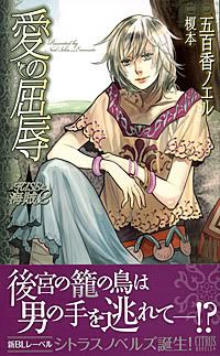
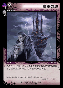
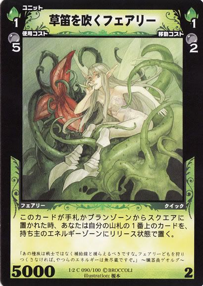
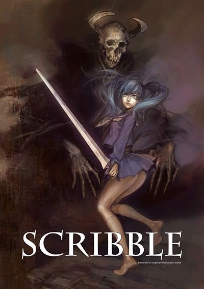
榎本 (Enomoto) is a professional freelance illustrator who also does doujinshi releases under the circle name BND. However, she is not currently looking for new projects or commissions to work on¹. She was born in 1979 in Wakayama Prefecture, Japan². Enomoto likes suits, and some of her favourite foods include tofu, vegetables, vitamin-type beverages, kimchi, cheese, and potatoes¹. She says that she has been on a diet for an eternity, but sometimes she has a tremendous craving for anpan¹. She also describes herself as drowsily³. Enomoto has worked on card game and BL novel illustrations. She has also done a colour comic for Volume 4 of Robot Super Color Comic. Enomoto mainly uses her digital tablet with an LCD screen⁴ with software such as SAI³, Photoshop², and Painter².
Enomoto seems to be friends with Wada rco and has worked with her on a few occasions, though they do not act together as a unit⁴. They both participated on providing designs for two tfarm t-shirts, collaborated on a doujinshi along with 芥川明 (AKUTAGAWA Akira), and distrubuted bonus sketch prints with purchases of each other’s doujin releases. They have also sold their doujinshi at the same table. As well, Enomoto and Wada rco were born in the same year².
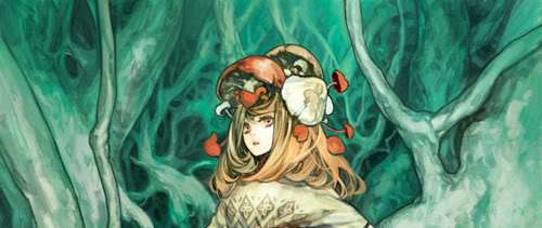
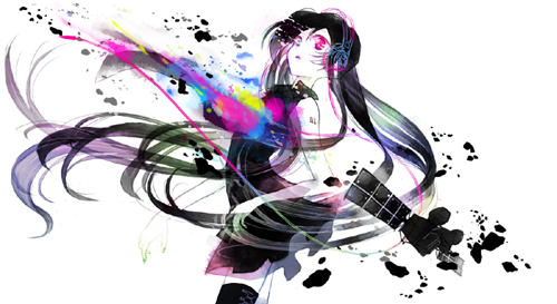
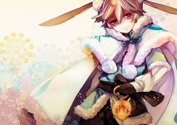
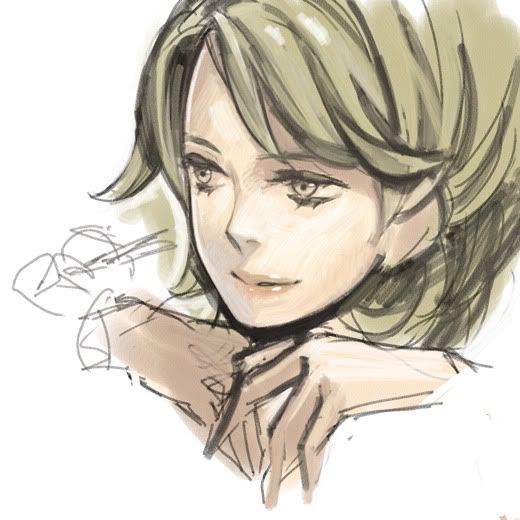
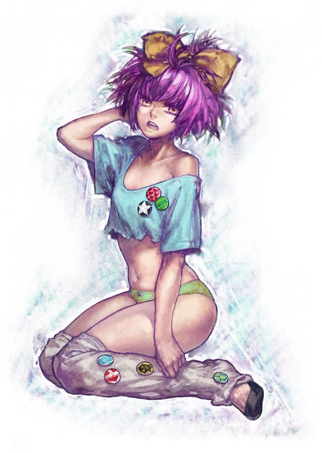
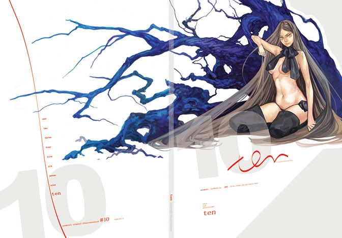
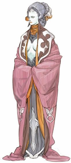
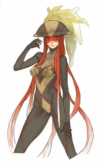
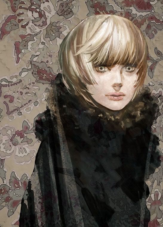
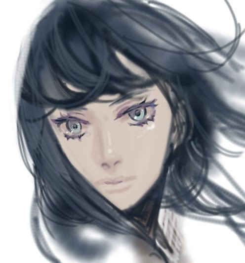
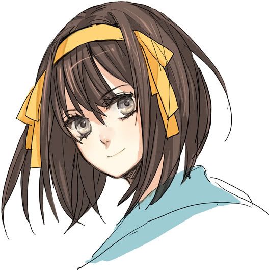
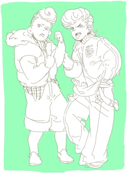
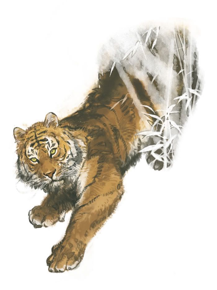
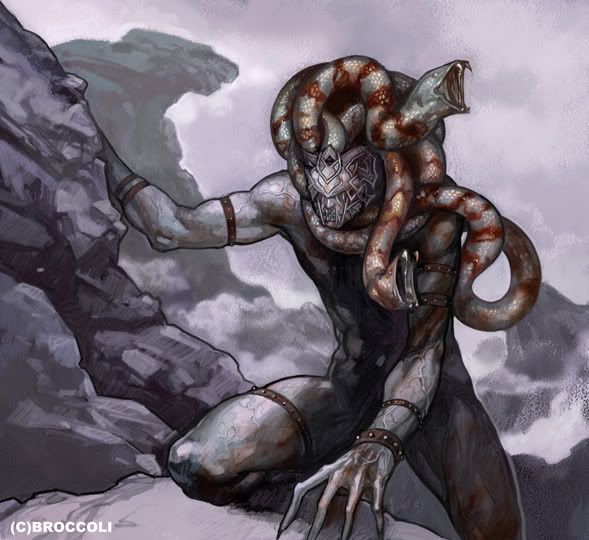
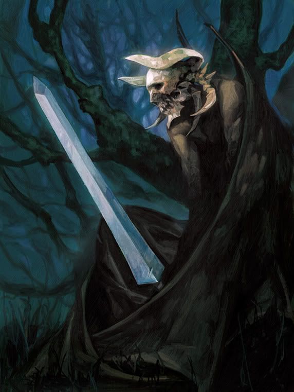
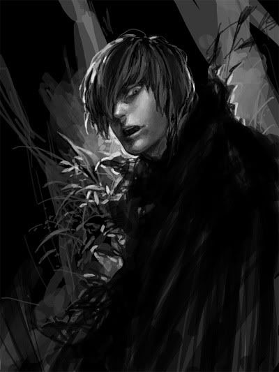
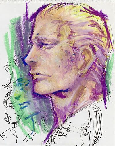
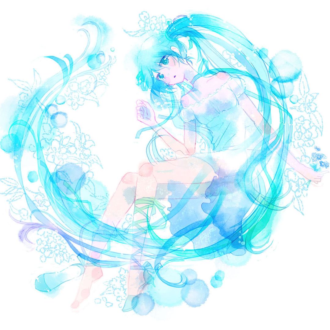
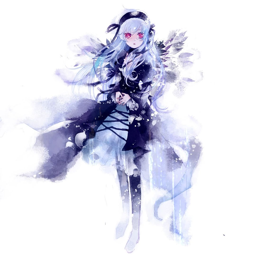
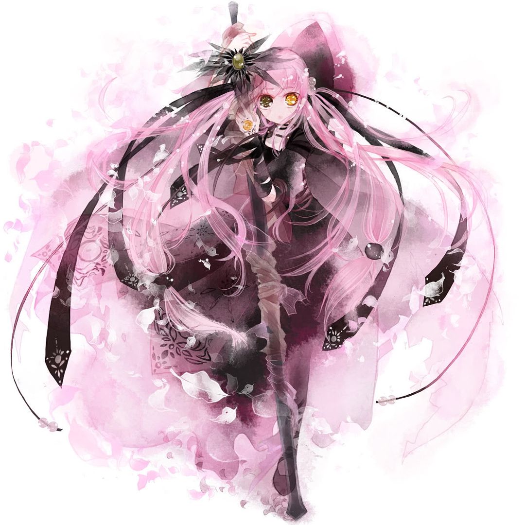
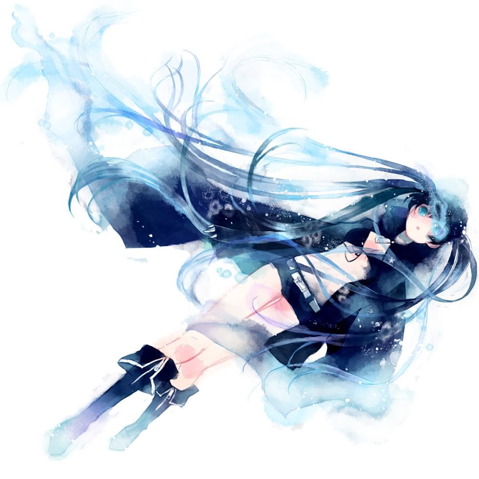
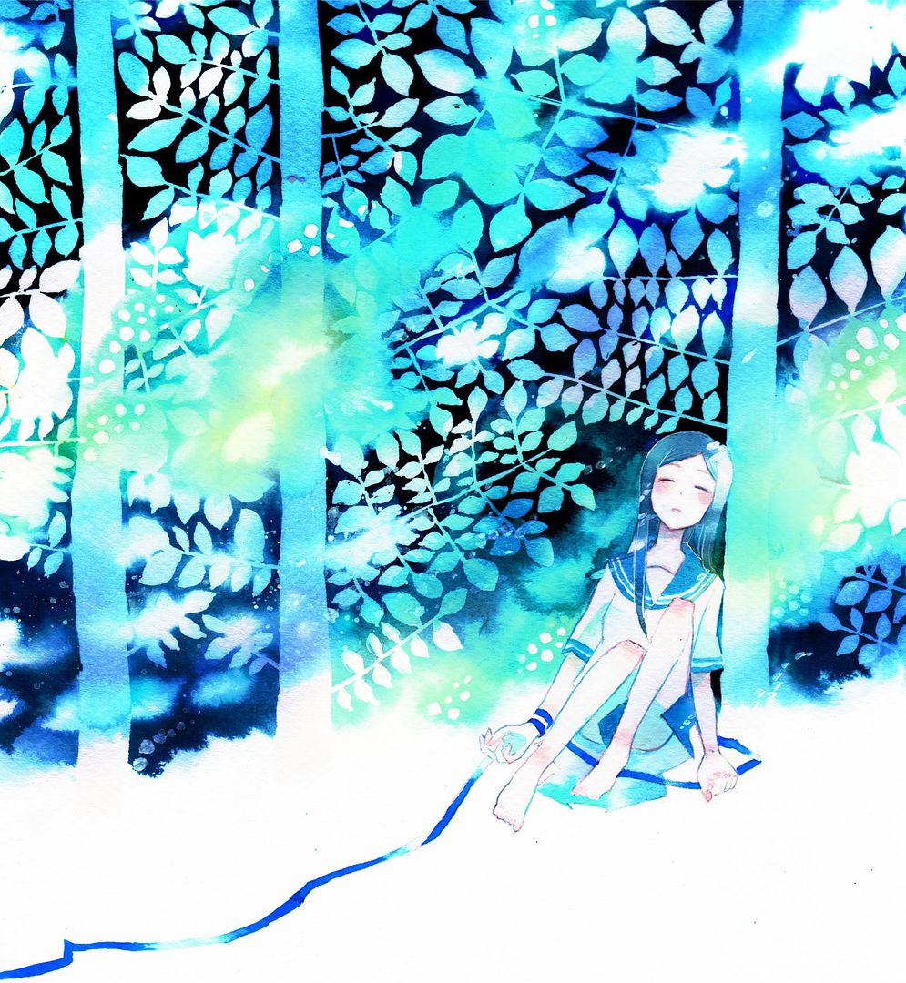
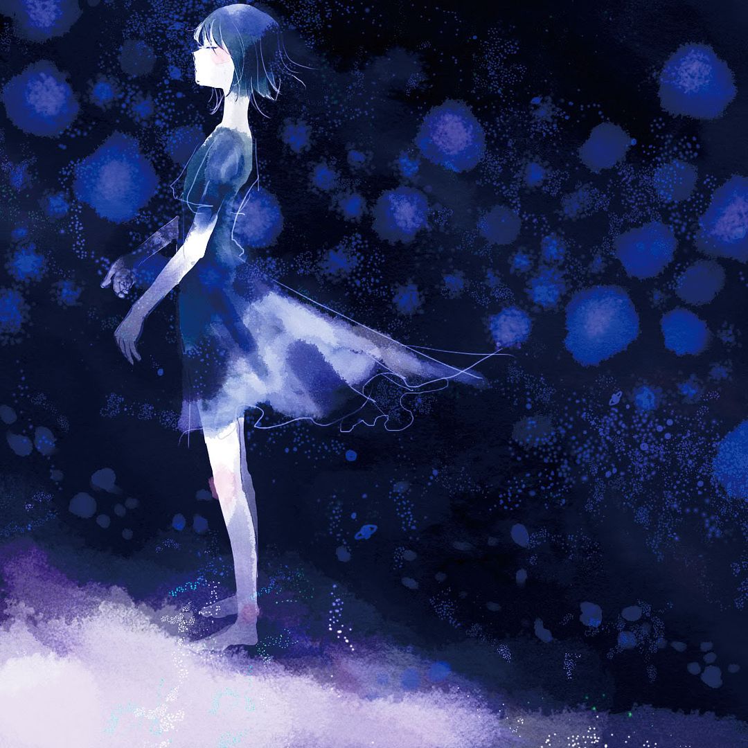
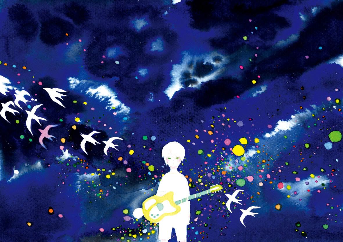
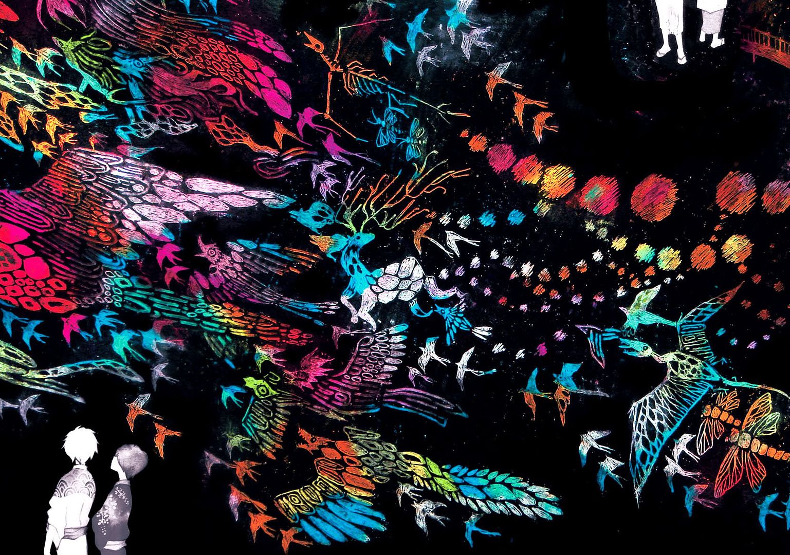
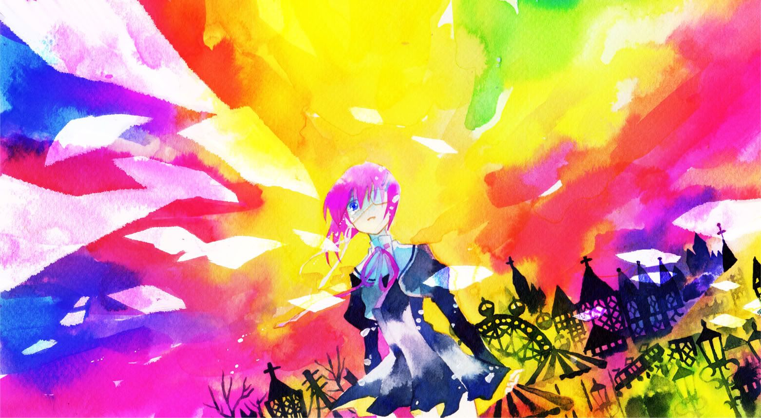
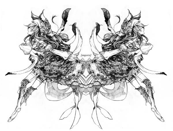
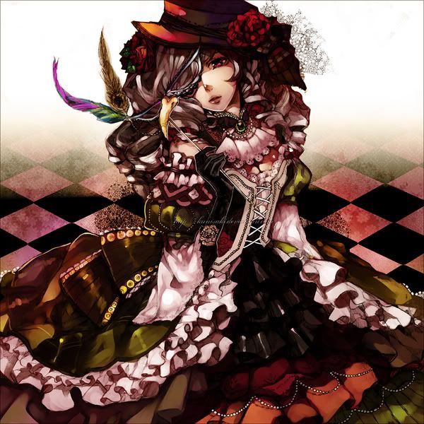
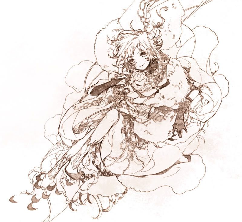
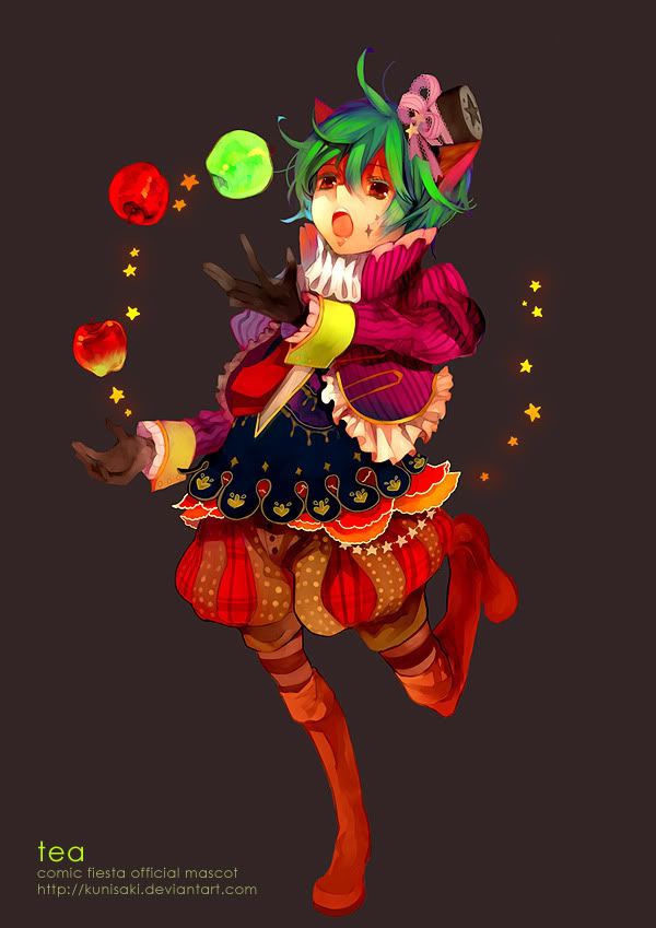
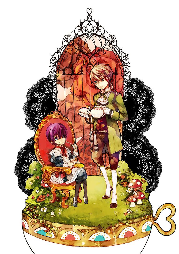
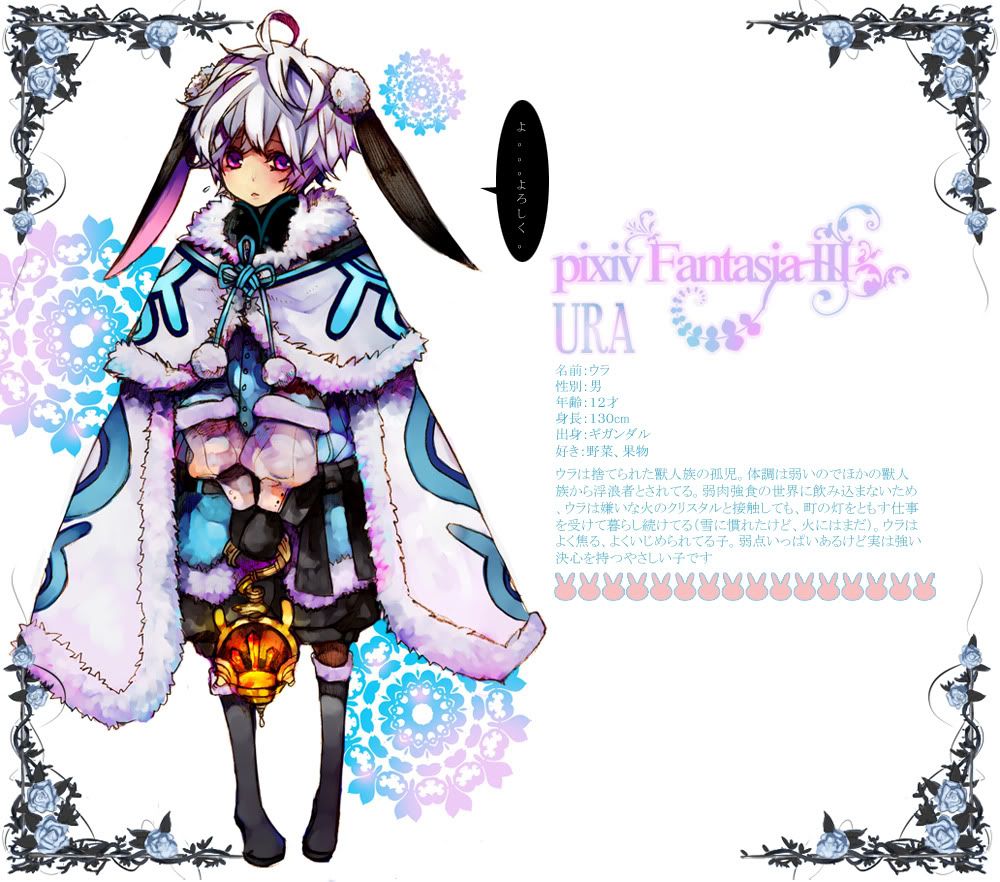
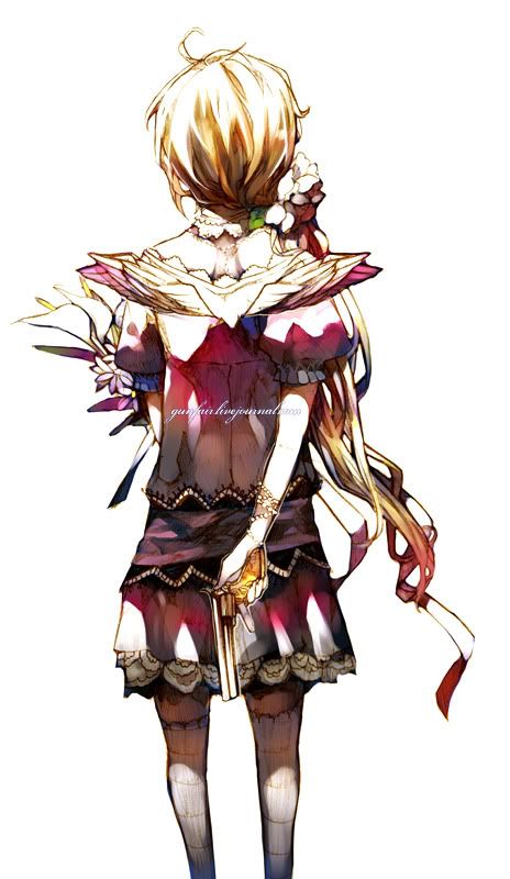
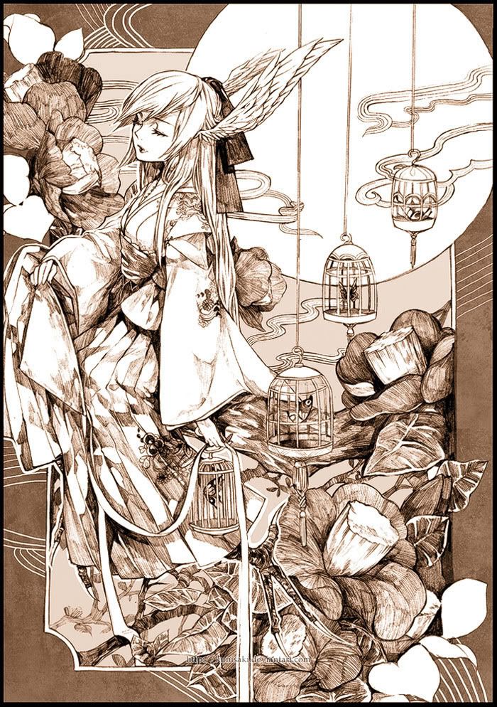
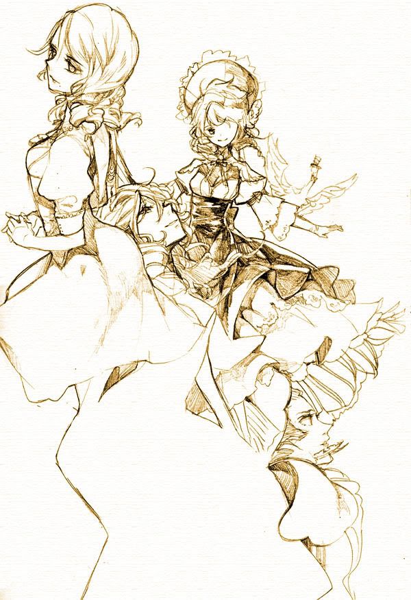
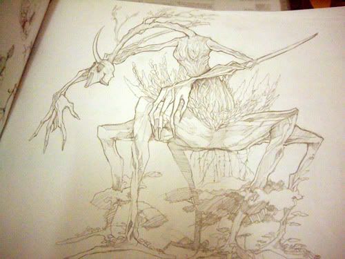
Enomoto’s style can be best described as realistic, mature, and classy. Her characters are almost always fully-featured and detailed with actual noses, lips, and eyelashes, and usually sport normally-proportioned bodies, but she can also draw more stylized body types as well. She also seems to know how to shade skin in all the right places, which shows in the many near-nude to nude artwork she produces. She also seems to like designing creative and lavish costumes, and as such, many of her characters are drawn in static poses so as to model their very unique and never repetitive clothing. Admittedly, illustrations where characters are depicted in very lively poses number few. As well, Enomoto’s character designs rarely, if ever, look rehashed, but the expressions on her characters usually do not depict much emotion, and instead usually range from subdued and neutral stares to slightly content smiles. There are, of course, exceptions, but the majority of her finished artwork have characters of the less expressive variety. In addition to drawing female characters, which tend to be the usual, Enomoto is more than capable of drawing masculine-looking men and even animals. Enomoto’s versatility is not limited to the above examples.
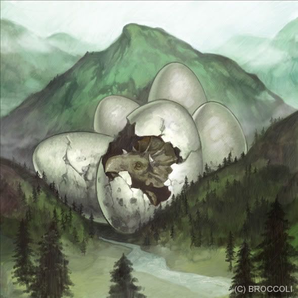
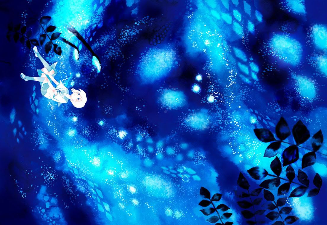
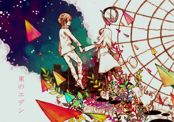
Enomoto is also no stranger to depicting relatively lush backgrounds, either, although back in 2004 she said that she was especially unskilled at drawing scenery². However, Enomoto’s backgrounds are well-coordinated and can be very complementary, but her preference for not drawing backgrounds shows as the large majority of her artwork have none. When she does draw them, though, she tends to depict nature, which in many cases include trees, as she said that she finds branches fun to draw².
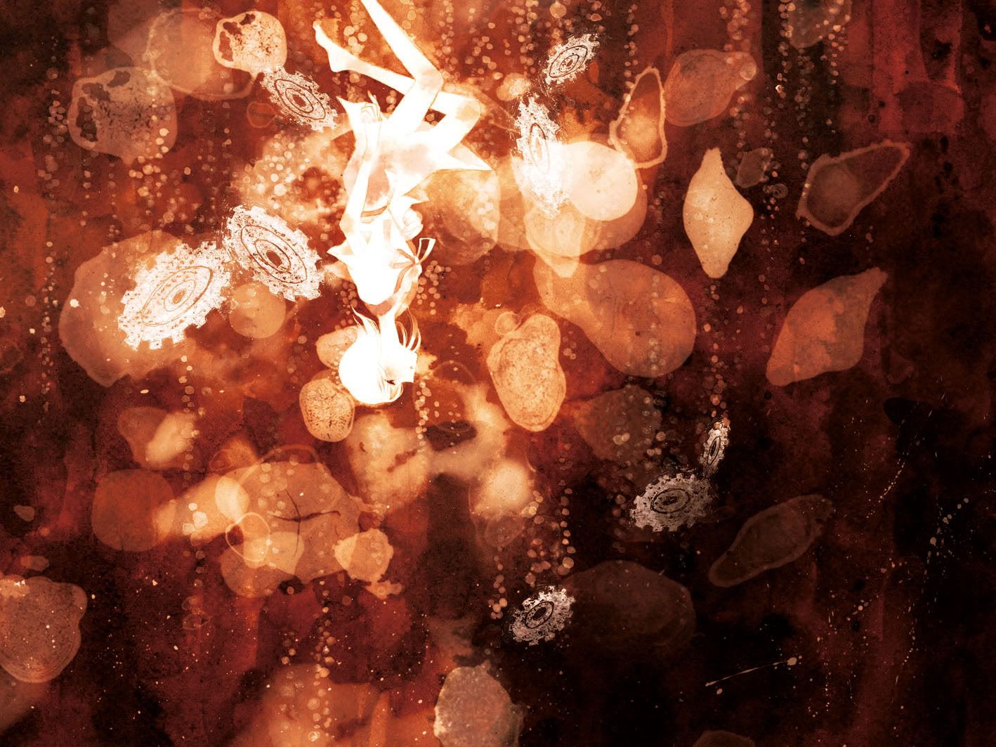
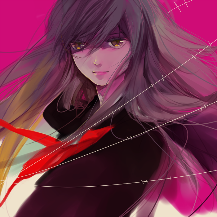
The colours which Enomoto frequently utilize further enhance the mature feel of her style, as she uses mainly muted and dark colours. The colours which she uses most include dark browns, dark greens, and black. Her colouring style usually looks as if it was done with coloured pencils, as the colours are solid though slightly blended and has some degree of layering, but the majority of her artwork is done digitally. Enomoto’s shading is very well done, shows a lot of depth, and seems to use different shades, such as purple, for shading, rather than merely choosing a darker shade of the same colour.
Website: http://homepage3.nifty.com/-bnd-
Blog: http://enom.blog32.fc2.com
Pixiv: http://www.pixiv.net/member.php?id=62660
Past doujinshi releases: http://www.keibunshakoutari.com/enomoto.html
Interview with enomoto and Wada rco at tfarm: http://www.tfarm-store.com/column/03.html
Sources:
1 – Website: “first” link
2 – Kikan S Volume 5, 2004 Winter, page 28-29
3 – Pixiv
4 – tfarm interview

